Case Study · 2023 · Banking / Open Banking

Designing trust into Open Banking.

An end-to-end Open Banking experience for Cynergy Bank — turning a complex API ecosystem into a clear, secure and confident customer journey.

Open BankingFinTechConsent & TrustMulti-platform
Role
Product / UX Designer
Timeline
6 Months
Team
3 designers (Lead, UX, me)
Client
Cynergy Bank × Wipro
Platforms
iOS · Android · Web · Desktop
Tools
Miro · Sketch · Excel · PPT
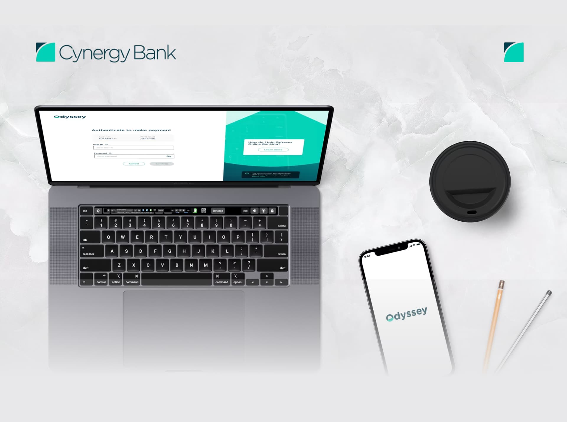
Cynergy Bank logoCynergy Bank Open Banking experience shown across laptop and mobile devices

0%

Task completion

0%

Faster journeys

0%

Fewer consent drop-offs

0M+

Annual API transactions

01 · Executive Summary

One simple action. A whole ecosystem behind it.

Customers expect banking to work inside the products they already use. Open Banking makes that possible — but only if the experience feels legitimate, transparent and recoverable.

Challenge

Behind a single customer action sat third-party apps, authentication, consent, Open Banking APIs, Wipro's platform and Cynergy Bank's core systems. The UX task was to make that invisible complexity feel clear and trustworthy.

Solution

An end-to-end experience built on four principles — transparency, consent, control and confidence — covering authentication, permissions, account information, beneficiaries, payments and failure recovery.

My role

Product / UX Designer across discovery, journeys, information architecture, consent and payment flows, negative scenarios, wireframes, visual design and prototypes, working with a design lead, a UX designer, BAs and engineering.

Outcome

95% task completion, 40% reduction in journey time, 35% reduction in consent drop-offs, and an experience supporting 20M+ annual API transactions.

What sits behind one tap

  1. Customer
  2. TPP
  3. Open Banking APIs
  4. Wipro platform
  5. Cynergy Bank
  6. Response
  7. TPP
  8. Customer
02 · The Challenge

Open Banking is powerful, but unfamiliar.

From a system view, APIs simply make banking services accessible. From the customer's view, the same moment raises uncomfortable questions — and money is involved.

Questions customers actually ask

  • What information am I sharing?
  • Why does this app need my bank information?
  • Who will have access to it?
  • Am I actually logging into my bank?
  • Why am I being redirected?
  • Did my payment go through?
  • What happens if something fails?
  • Can I stop sharing my information later?

Problem statement

How might we simplify complex Open Banking journeys so customers can securely access banking services through third-party providers while clearly understanding consent, authentication, permissions and transaction status?

Who felt it

Customers of Cynergy Bank using authorised third-party apps.

Why it mattered

Financial information and real money — hesitation becomes abandonment.

Business consequence

Consent drop-offs break the value of the whole API programme.

Constraints

Regulated flows, API behaviour, multi-party ecosystem, four platforms.

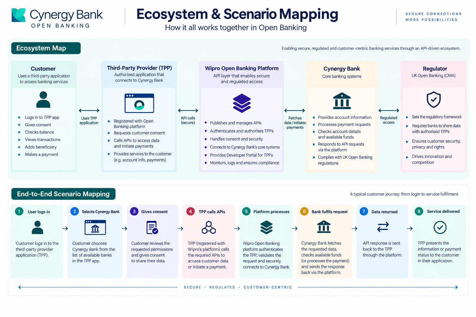
03 · Understanding the Ecosystem

The customer journey and the system journey are not the same thing.

The earliest and most useful thing I learned: designing only the screens the customer touches ignores the systems that decide what those screens can honestly say.

What the customer sees

  1. Login
  2. Connect bank
  3. Give consent
  4. View / pay
  5. Confirmation

What happens behind it

  1. 01Customer
  2. 02Third-party provider (Odyssey)
  3. 03Open Banking APIs
  4. 04Wipro Open Banking platform
  5. 05Cynergy Bank core banking systems
  6. 06Bank response
  7. 07Wipro APIs
  8. 08Third-party provider
  9. 09Customer

Cynergy Bank

Owns banking operations, data and security.

Wipro platform

Provides the Open Banking APIs and integration layer.

Developer portal

Documentation and resources for TPPs and developers.

Cynergy Bank Open Banking ecosystem and scenario map
04 · Research

Understanding the people behind the API.

Rather than one user, this product had five stakeholders whose needs constrained each other. I framed the research around what each one had to understand or protect.

Customer

What do I need to understand before I trust this?

Third-party provider

What do we need to integrate successfully with the platform?

Bank

What operations and data must stay secure and controlled?

Developer

How do APIs and documentation stay predictable?

Internal teams

How do business, design, technology and compliance stay aligned?

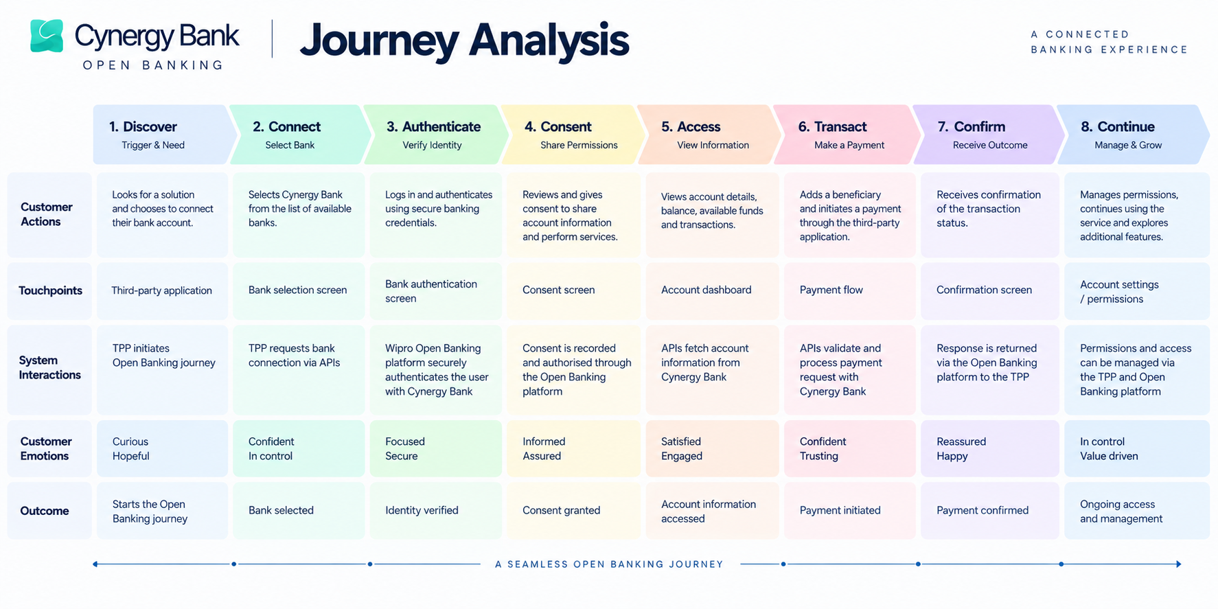
Cynergy Bank journey analysis workshop board
Cynergy Bank ecosystem and scenario mapping
05 · Research Themes

Four concerns kept coming back.

01

Trust

Customers needed confidence they were inside a legitimate banking flow — especially at the moment of redirection.

02

Transparency

Users needed to know exactly which information they were granting access to, and why it was needed.

03

Control

Consent had to feel like an active decision, not a screen people were pushed through.

04

Recovery

Banking journeys cannot assume success — every failure needed an explanation and a way forward.

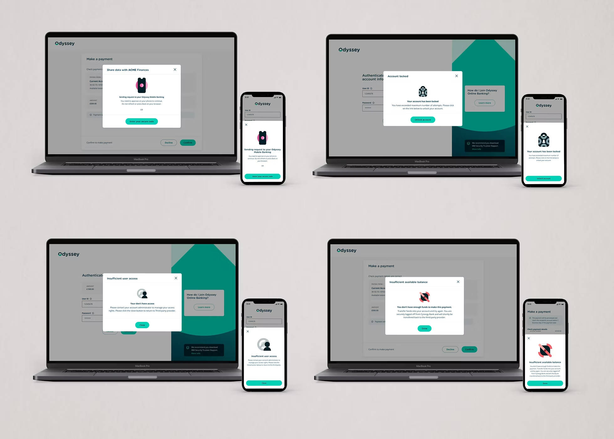
Failure states the experience had to account for

Authentication failureSession timeoutInvalid requestAPI timeoutInsufficient fundsPayment failureExpired authorisationConnectivity issuesUnclear transaction status

Opportunity statement

Treat the handover between third-party app and bank not as a technical redirect, but as a trust transition — the single moment where the entire journey is either believed or abandoned.

06 · Customer Journey

From third-party app to banking service.

Nine stages, mapped from the customer's perspective and annotated with the UX goal at each transition.

  1. Stage 01

    Enter

    The customer logs into the third-party application.

    Customer goal: access a banking-related service.

  2. Stage 02

    Connect

    The customer chooses Cynergy Bank as their bank.

    Customer question: “Why am I being asked to connect my bank?”

  3. Stage 03

    Understand

    Permissions and requested information are shown.

    UX goal: make the request understandable before asking for consent.

  4. Stage 04

    Authenticate

    The customer authenticates through the banking journey.

    UX goal: maintain confidence while moving between systems.

  5. Stage 05

    Consent

    The customer explicitly approves the requested access.

    UX goal: transparency and control.

  6. Stage 06

    Request

    The TPP sends the authorised request through the APIs.

    TPP → Wipro Open Banking APIs → Cynergy Bank.

  7. Stage 07

    Process

    The bank validates and processes the request.

    Account details, balance, available funds, transactions, beneficiary or payment initiation.

  8. Stage 08

    Respond

    The response travels back through the platform.

    Cynergy Bank → Wipro APIs → TPP.

  9. Stage 09

    Experience

    The TPP presents the result to the customer.

    The customer sees the outcome, not the API complexity.

End-to-end Cynergy Bank customer journey analysis
07 · Information Architecture & Flows

Structured around customer goals, not system architecture.

The APIs were organised around capabilities. The experience had to be organised around what people were trying to do.

Information architecture

Connect bank

Select bankAuthenticationConsent

Accounts

Account detailsBalanceAvailable fundsTransactions

Payments

BeneficiariesAdd beneficiaryMake paymentPayment statusPayment history

Permissions

Active permissionsManage / revoke

Support

HelpError recovery

Core flow · connecting a bank account

  1. Open TPP
  2. Choose Cynergy Bank
  3. Review access request
  4. Authenticate
  5. Review permissions
  6. Give consent
  7. Account connected
  8. View information

The critical moment is the transition between the TPP and the bank — designed as a trust transition rather than a redirect.

Payment journey

  1. Select payment
  2. Choose / add beneficiary
  3. Enter details
  4. Review
  5. Authenticate
  6. Confirm
  7. Processing
  8. Success / failure / pending

Payments carry higher emotional risk than viewing information, so status and recovery became first-class requirements: what happened, is my money safe, was it successful, what next.

08 · Designing the Negative Path

The happy path is only half the experience.

Instead of asking only what happens when everything works, I worked through what happens when it doesn't. This is the contribution that moved the work from screen design to service design.

Negative scenarios, customer concerns and UX responses
ScenarioCustomer concernUX response
Session timeout“Do I need to start again?”Clear status + recovery
API timeout“Did my request reach the bank?”Explain the processing state
Payment failure“Did money leave my account?”Clear outcome + next action
Invalid request“What did I do wrong?”Human-readable explanation
Authentication failure“Why can't I continue?”Explain + retry
Insufficient funds“Why was the payment rejected?”Clear reason + recovery
Expired consent“Why am I being asked again?”Explain renewed authorisation
09 · Design Principles

Four principles that settled arguments.

Every debate about wording, placement or number of steps was resolved against these four.

01

Transparency

Tell users what is happening. What data? Why? Who?

02

Control

Let users make informed decisions. Consent should feel like a choice.

03

Confidence

Make every system transition understandable. Never leave users wondering.

04

Recovery

Every failure provides a path forward — not just “something went wrong”.

10 · Wireframes & Visual Design

Validate the logic first, then the surface.

Wireframes let the team agree on permission clarity, authentication transitions, status and recovery before anything was styled. Business approval was required before moving into visual design.

Wireframes focused on

  • Content hierarchy
  • Permission clarity
  • Authentication transitions
  • Primary actions
  • Error states
  • Payment status
  • Recovery paths
  • Responsive behaviour

Visual direction — trust, clarity, stability, confidence

  • Strong information hierarchy
  • Generous whitespace and consistent spacing
  • Clear primary actions
  • Restrained colour usage
  • Strong success / error differentiation
  • Readable typography and consistent components
  • Accessible interaction patterns

The objective was never to make banking look technical — it was to make the complexity feel invisible.

11 · Prototype & Validation

Reviewing the service, not the screen.

The prototype connected the major journeys end to end so the team could judge the experience as a whole. Flows and scenarios were reviewed with the Business Analyst and wider team before final visual design.

Account connection

Select bank → Authentication → Consent → Connected

Account information

Account → Balance → Available funds → Transactions

Beneficiary

Beneficiaries → Add → Verify → Confirmation

Payments

Payment → Review → Authentication → Processing → Status

Recovery

Error → Explanation → Action → Recovery

Iteration cycle

  1. Research
  2. Journey mapping
  3. Scenarios
  4. Wireframes
  5. BA / stakeholder review
  6. Iteration
  7. Visual design
  8. Prototype
  9. Validation

The most important shift was moving from “does this screen work?” to “does the complete service make sense?”

Cynergy Bank Open Banking experience across laptop and mobile
12 · Final Solution

A trust-centric Open Banking experience.

01 · Design decision

Secure connection

What
A guided journey to connect a bank account through the authorised Open Banking flow.
Why
The handover between app and bank was where customers hesitated most.
Problem it solves
Removes the “am I really at my bank?” doubt at the moment of authentication.
02 · Design decision

Transparent consent

What
Permissions written in plain language, grouped by what is being shared and why.
Why
Consent is a decision, not a formality — people need to read it to accept it.
Problem it solves
Directly addresses consent drop-offs and unclear data sharing.
03 · Design decision

Clear account information

What
Balance, available funds and transactions presented with a strong hierarchy.
Why
Available funds and balance mean different things and were routinely confused.
Problem it solves
Lets people answer “what can I actually spend?” at a glance.
04 · Design decision

Beneficiary management

What
Adding, verifying and managing beneficiaries inside the payment journey.
Why
Beneficiary setup was a hidden prerequisite that blocked payments mid-flow.
Problem it solves
Prevents dead ends at the point of paying someone new.
05 · Design decision

Payment initiation & status

What
A review-then-authenticate payment flow with explicit success, processing, failed and action-required states.
Why
When money moves, ambiguity is the worst possible outcome.
Problem it solves
Answers what happened, whether money is safe, and what to do next.
06 · Design decision

Resilient recovery

What
Every failure state explains the cause in human language and offers the next action.
Why
Negative paths are where trust in a bank is actually decided.
Problem it solves
Turns dead ends into recoverable journeys.
07 · Design decision

Permissions control

What
A place to see active permissions and revoke access.
Why
Control after consent is what makes the original consent credible.
Problem it solves
Answers “can I stop sharing this later?” before it is asked.
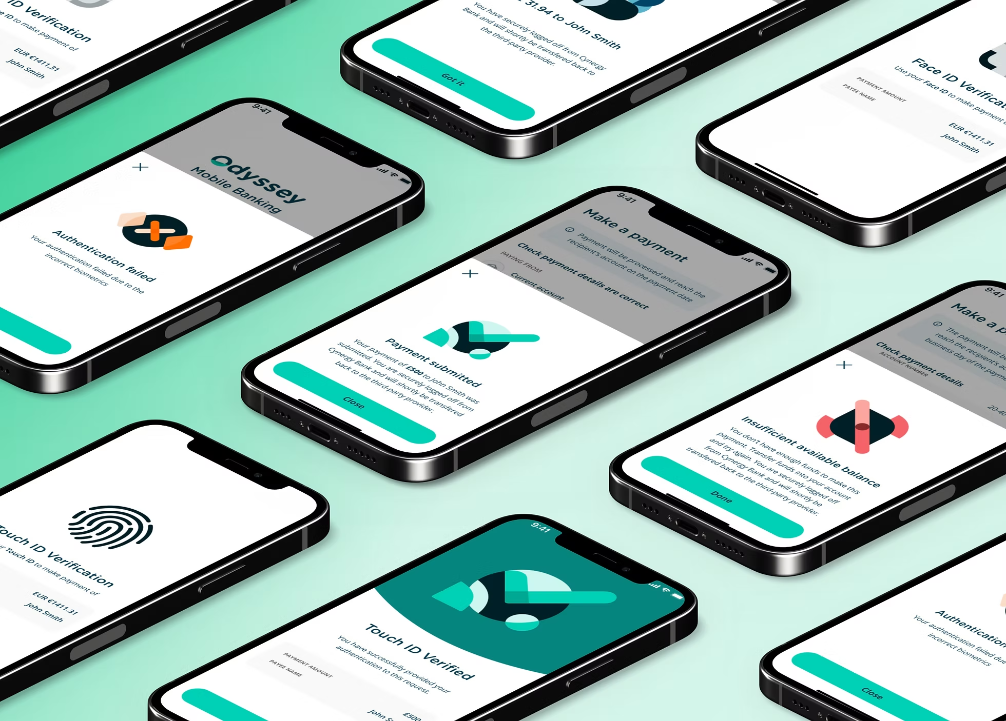
Cynergy Bank Open Banking mobile interface screens
13 · Impact

What changed.

Reported project outcomes. The larger value was an experience that could sit on top of a complex Open Banking ecosystem without losing trust.

0%

Task completion

0%

Reduction in journey time

0%

Reduction in consent drop-offs

0M+

Annual API transactions supported

Qualitative outcome

  1. Trust
  2. Understanding
  3. Control
  4. Confidence
14 · My Contribution

What I personally owned.

I worked in a team of three designers — a design lead, a UX designer and me — alongside business analysts, stakeholders and engineering.

Discovery

  • Ecosystem understanding
  • Customer & TPP journeys
  • Behaviour and expectations
  • Trust & usability concerns

UX

  • Customer journeys
  • User flows
  • Information architecture
  • Consent & authentication flows
  • Payment journeys
  • Negative scenarios & recovery

Design

  • Wireframes
  • Interaction design
  • Responsive experiences
  • Visual design in Sketch
  • Prototypes
  • Design patterns

Collaboration

  • BA reviews
  • Stakeholder discussions
  • Iterative validation
  • Developer collaboration
  • Business approval before visual design

The contribution I am most proud of is thinking through what could go wrong, rather than designing only the happy path.

15 · Key Learnings

UX doesn't stop at the interface.

Design the system, not the screen

Why it mattered

In a multi-party ecosystem, the honest answer to “what should the user see next?” depends on what the API can confirm.

How it changed my approach

I now start by mapping system states before layouts.

Failure states are the product

Why it mattered

Timeouts, rejections and expired consent were where customers decided whether to trust the bank again.

How it changed my approach

I treat negative scenarios as required deliverables, not edge cases.

Consent is a comprehension problem

Why it mattered

Drop-offs were less about steps and more about people not understanding what they were approving.

How it changed my approach

I write permission content before designing the permission screen.

Hide complexity, not information

Why it mattered

Removing detail felt cleaner but left people uncertain about their money.

How it changed my approach

I sequence information by moment instead of reducing it.

Business analysts are design partners

Why it mattered

BA reviews surfaced regulatory and API realities that would have invalidated pretty flows.

How it changed my approach

I bring flows to BAs early, in low fidelity.

16 · Conclusion

From API complexity to customer trust.

Open Banking created an opportunity for customers to access banking services through authorised third-party providers. Behind every simple action sat authentication, consent, APIs, security, third-party applications and Cynergy Bank's core systems.

I mapped the ecosystem, researched customer behaviour, identified trust and usability barriers, created journeys and information architecture, explored positive and negative scenarios, developed wireframes, collaborated with business stakeholders, and translated the validated experience into visual designs and prototypes.

The result simplified account connectivity, consent, authentication, account information, beneficiary management and payments while giving people clear status and a path out of failure — with 95% task completion, 40% faster journeys, 35% fewer consent drop-offs and support for 20M+ annual API transactions.
Great UX doesn't remove complexity from the system — it removes unnecessary complexity from the customer's experience.